Paint color has a powerful influence on how a home looks, feels, and functions. The right shade can make a room feel larger, brighter, calmer, or more inviting, while the wrong one can make even a beautiful space feel off balance. For homeowners along the Main Line of Philadelphia, where homes range from historic stone colonials to updated contemporary properties, choosing the right paint tones is both an art and a science.
Color affects mood, perception, and even behavior. Understanding how light, room size, architecture, and function interact with color can help you make confident choices that enhance daily living and protect long-term property value.
Whether you are refreshing your home for yourself or preparing it for sale, the guide below breaks down how to select paint colors that work beautifully in every room.
Understanding how color works in a home
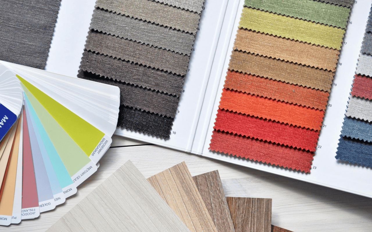
Before choosing individual room colors, it helps to understand a few foundational principles. Color temperature refers to whether a hue feels warm or cool. Warm colors like soft whites with beige undertones, greige, warm taupe, and muted earth tones create a sense of comfort and intimacy. Cool colors like crisp whites, light grays, and soft blues feel fresh, airy, and calm.
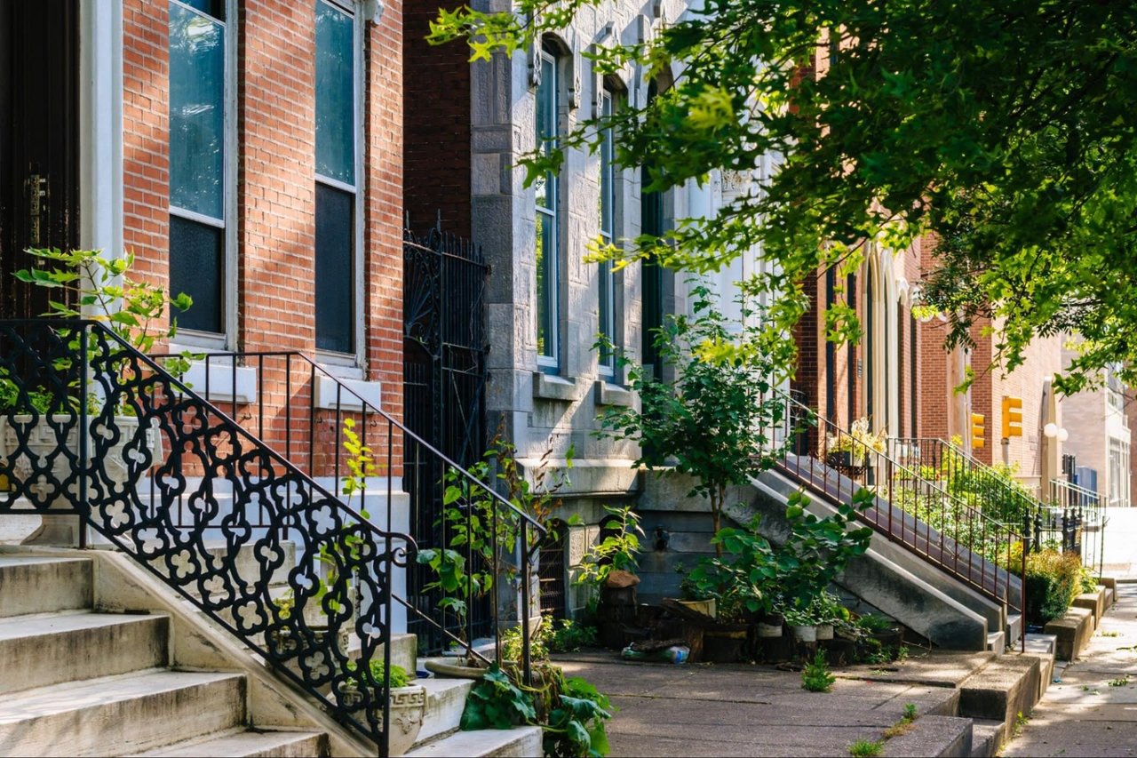
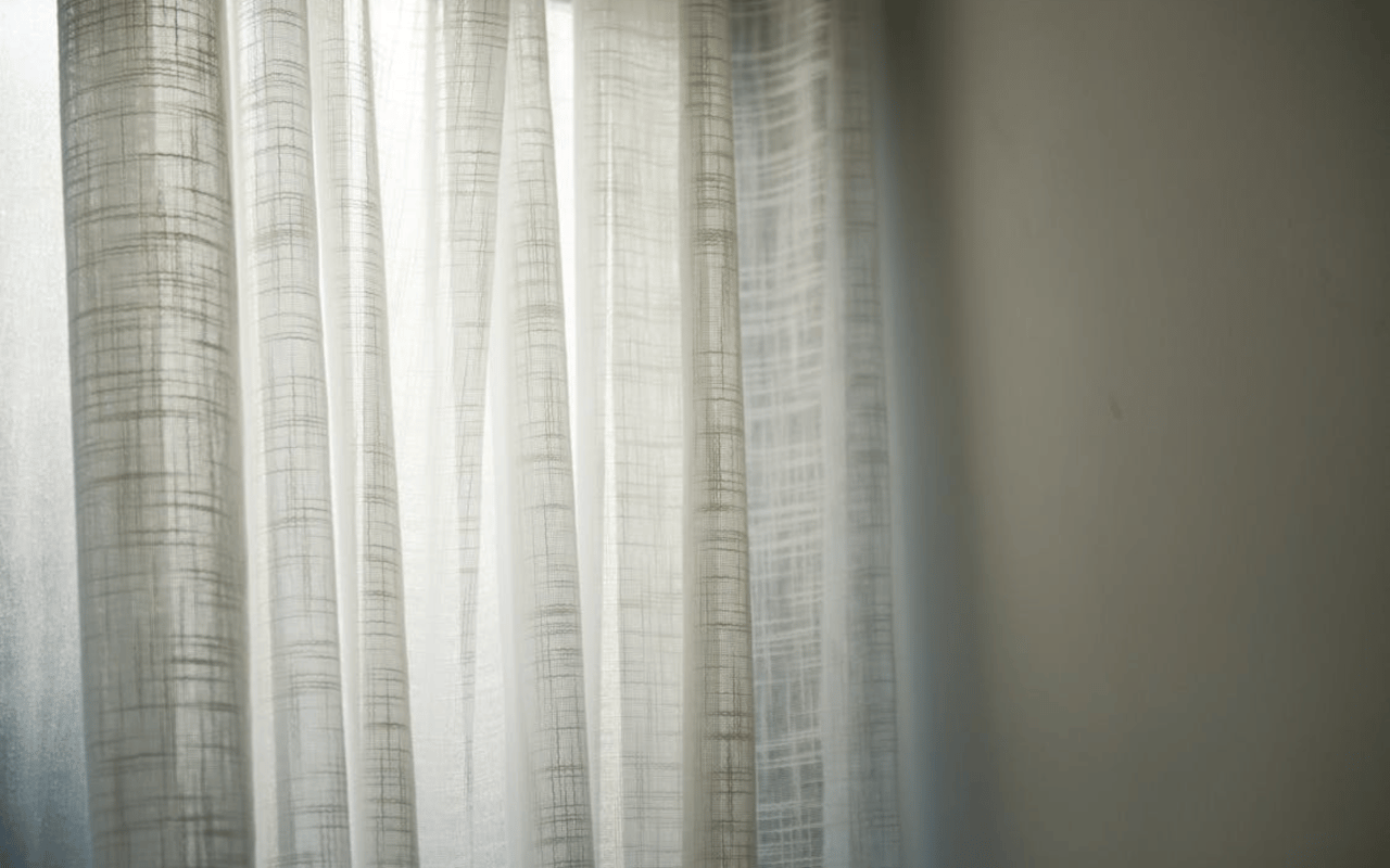
Natural light plays a major role, especially in Main Line homes with large windows, deep-set stone walls, or mature landscaping that can filter sunlight. A room with southern exposure can handle deeper or cooler tones, while north-facing rooms often benefit from warmer shades that counteract cooler light.
Sheen matters as well. Flat and matte finishes absorb light and hide wall imperfections, making them ideal for older homes with plaster walls. Satin and eggshell finishes reflect more light and are easier to clean, which works well in family living areas.
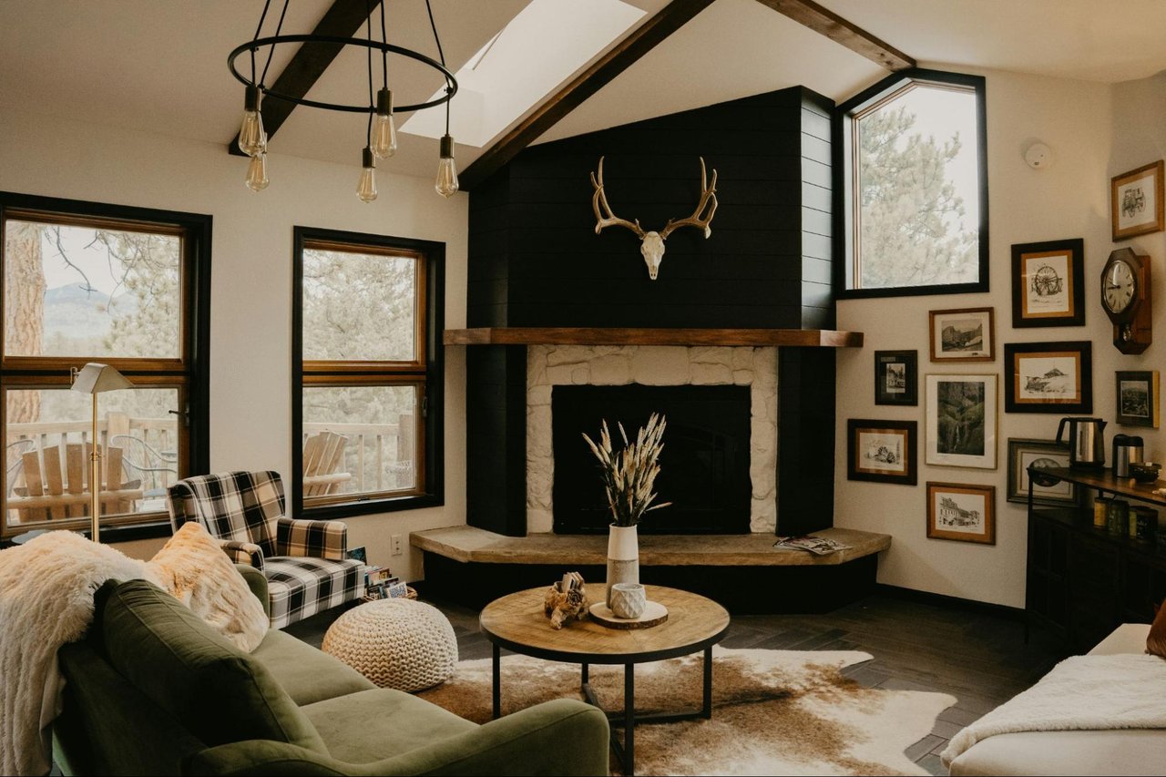
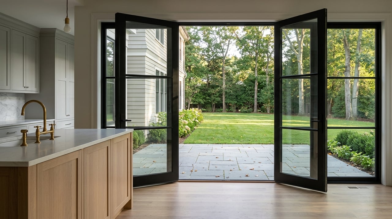
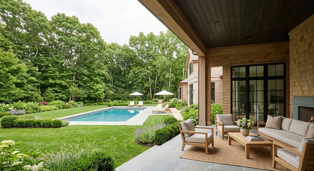
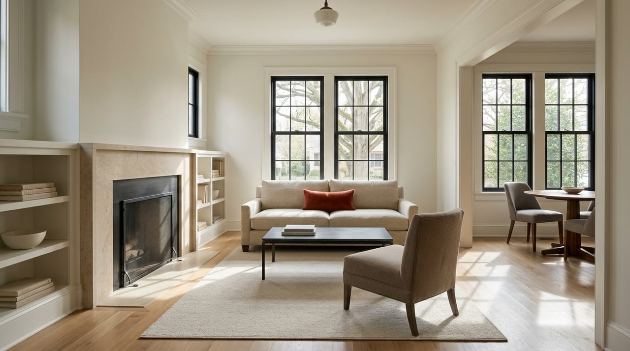
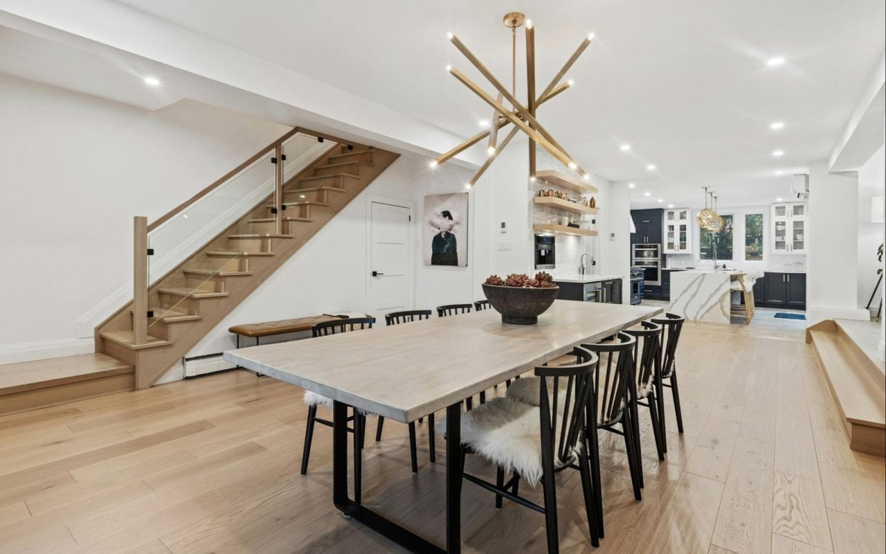
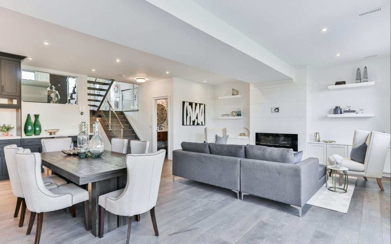
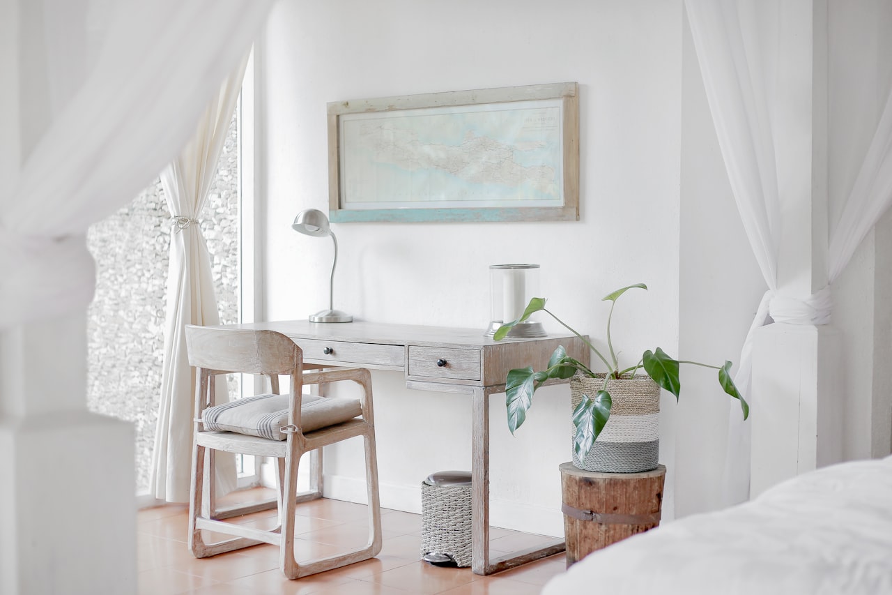
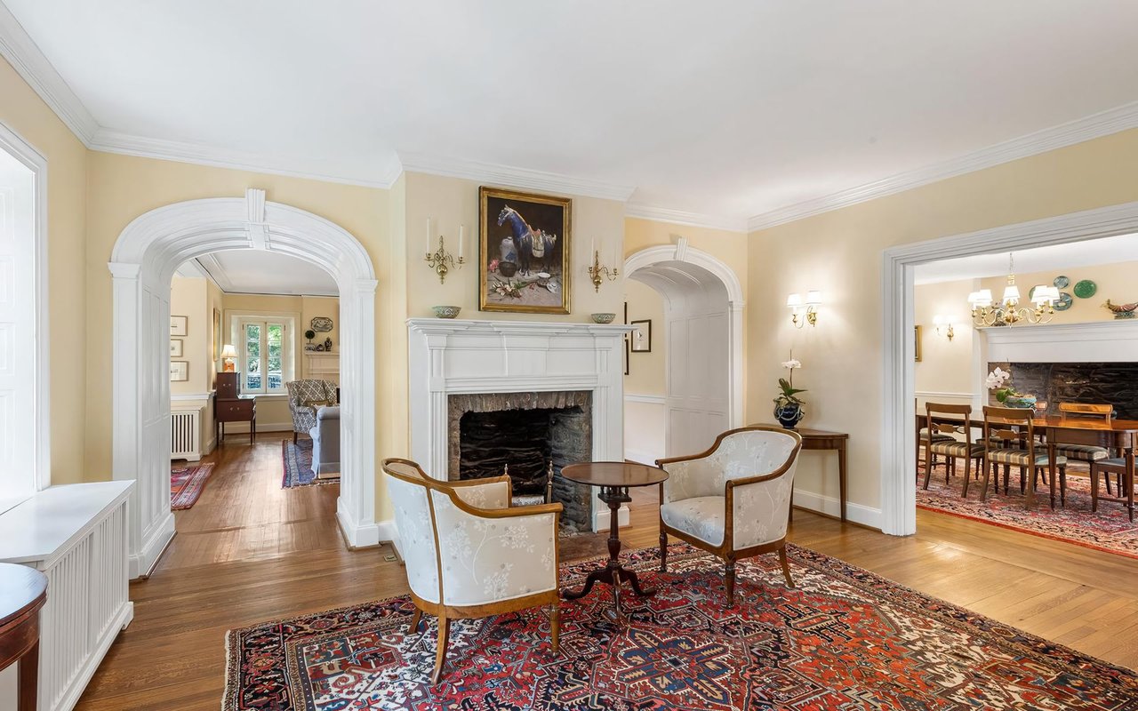
Choosing paint colors for the living room
The living room is often the most visible and versatile space in the home. It hosts everything from quiet evenings to social gatherings, so the color should feel welcoming without overpowering the room.
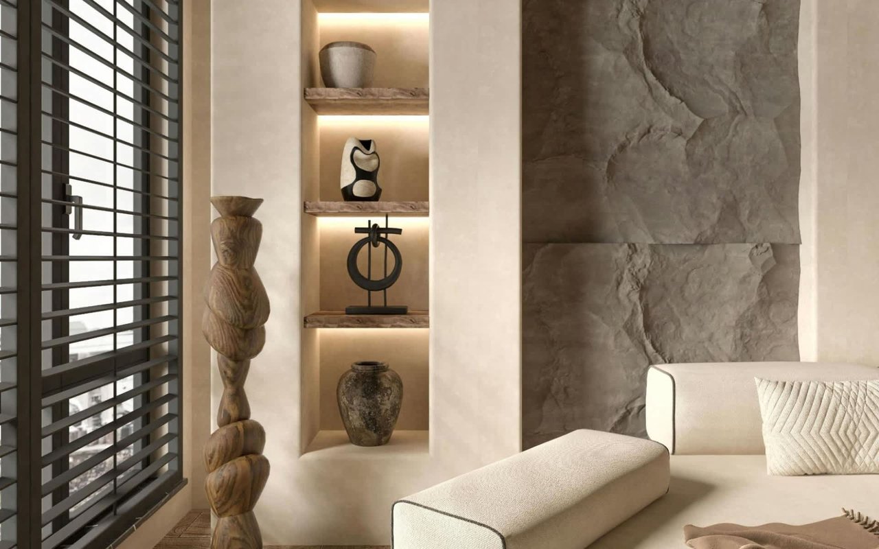
Neutral tones remain the most popular choice in Main Line living rooms, especially soft whites, warm grays, greige, and light taupe. These colors highlight architectural features like crown molding, fireplaces, and built-ins that are common in older homes in Bryn Mawr and Haverford.
If you want more depth, consider muted blues, sage greens, or warm clay tones. These add personality while remaining sophisticated and timeless. Avoid overly dark or bold colors unless the room has ample natural light and strong visual balance.
Creating calm in the bedroom
Bedrooms should promote rest and relaxation, which makes softer, cooler colors a natural fit. Pale blues, soft greens, warm off-whites, and light lavender-grays are popular choices because they reduce visual stimulation and create a peaceful atmosphere.
In Main Line homes with larger primary bedrooms, mid-tone neutrals can work beautifully, especially when paired with layered lighting and natural textures. For smaller bedrooms, lighter shades help the space feel open and uncluttered.
Accent walls are less popular than they once were, but if you choose to use one, keep it subtle. A slightly deeper version of the wall color often works better than a bold contrast.
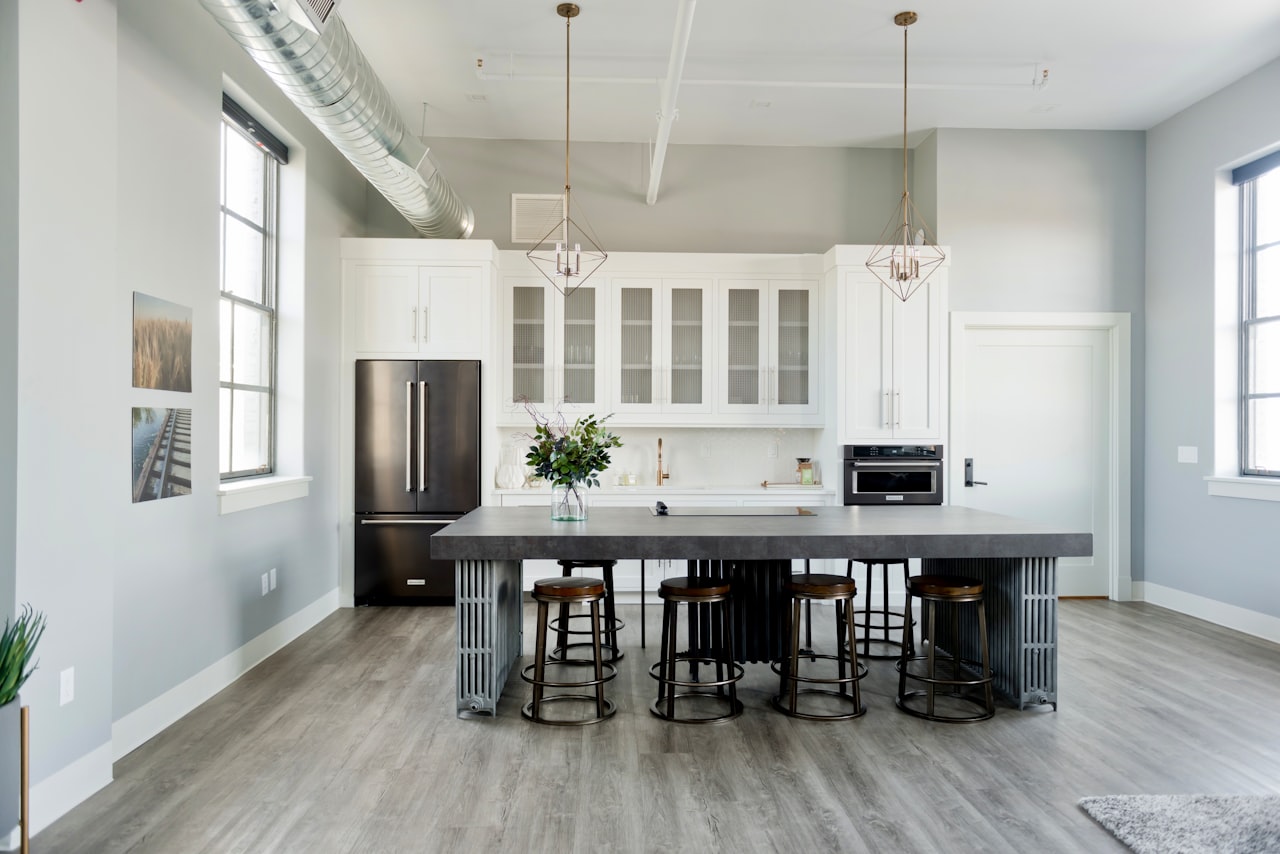
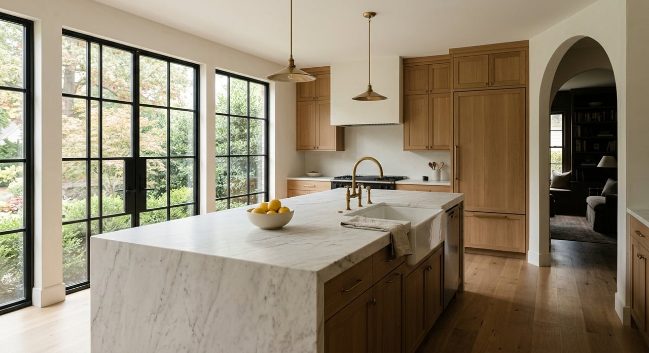
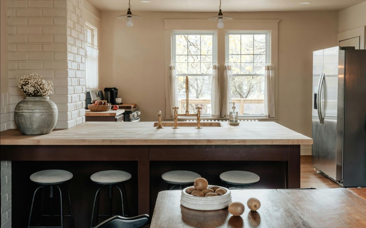
Picking the right color for the kitchen
Kitchens are one of the most important rooms when it comes to both daily enjoyment and resale value. Color choices here should feel clean, bright, and timeless.
White kitchens remain a favorite, but the undertone matters. Warm whites pair well with wood floors and traditional cabinetry, while cooler whites complement modern finishes. Soft gray, greige, and light beige tones also work well, especially in homes where the kitchen opens into other living areas.
For cabinets or islands, deeper colors like navy, charcoal, or forest green can add contrast without overwhelming the space. The key is balance. Bold color works best when grounded by neutral walls and plenty of light.
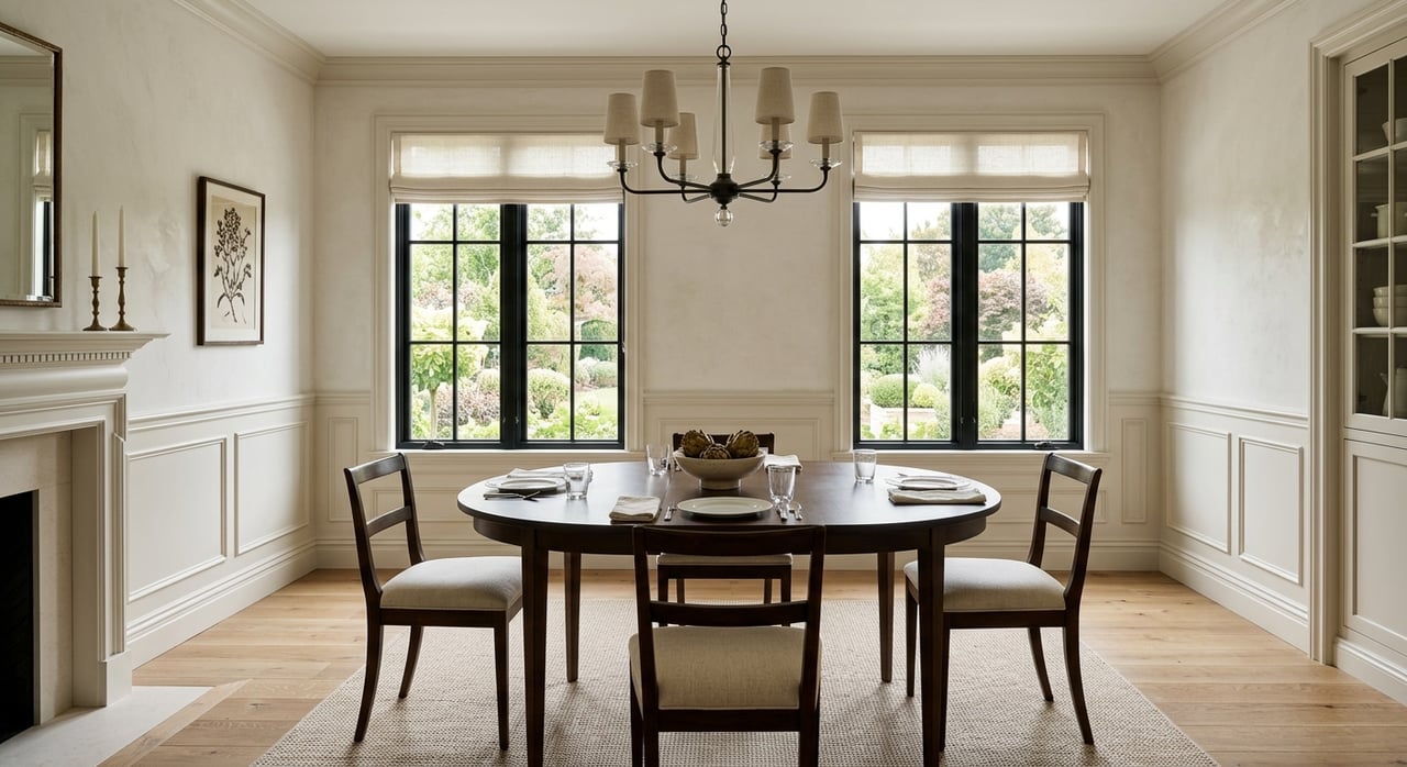
Dining rooms that feel intentional
Dining rooms benefit from colors that encourage comfort and conversation. Historically, dining rooms were often painted in richer tones, and that approach still works in many Main Line homes with formal layouts.
Warm neutrals, soft terracotta, muted olive, or deep blue-gray tones can create an inviting atmosphere. In more formal spaces, deeper colors add elegance and intimacy, especially when paired with warm lighting.
If the dining room is part of an open floor plan, continuity matters. Choose a shade that complements adjacent spaces rather than competing with them.
Bathrooms and the illusion of space
Bathrooms are typically smaller, which makes color selection especially important. Light colors help reflect light and make the room feel larger and cleaner.
Soft whites, pale grays, light blues, and gentle greens are all excellent choices. These shades pair well with tile, stone, and metal finishes commonly found in Main Line bathrooms.
In powder rooms, you can be more adventurous. Deeper colors or patterned wallpaper can add personality to a small space without overwhelming the home, especially when the rest of the house remains neutral.
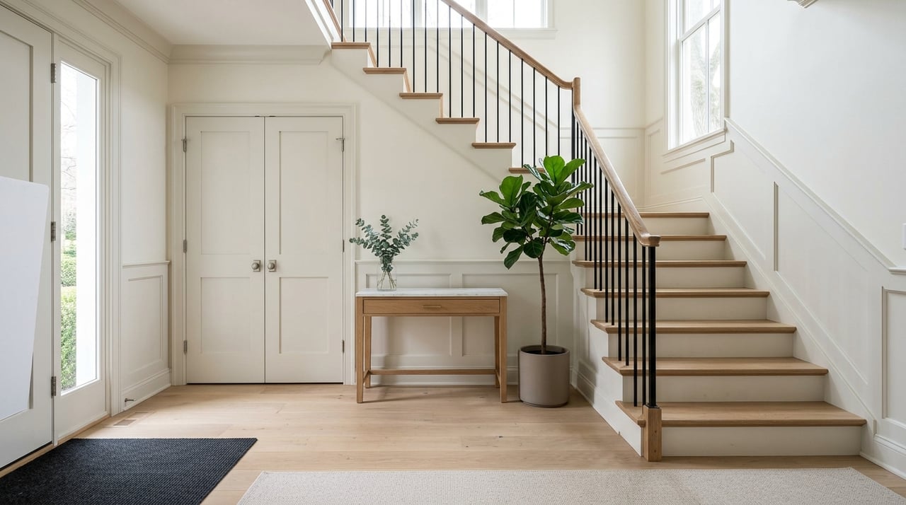
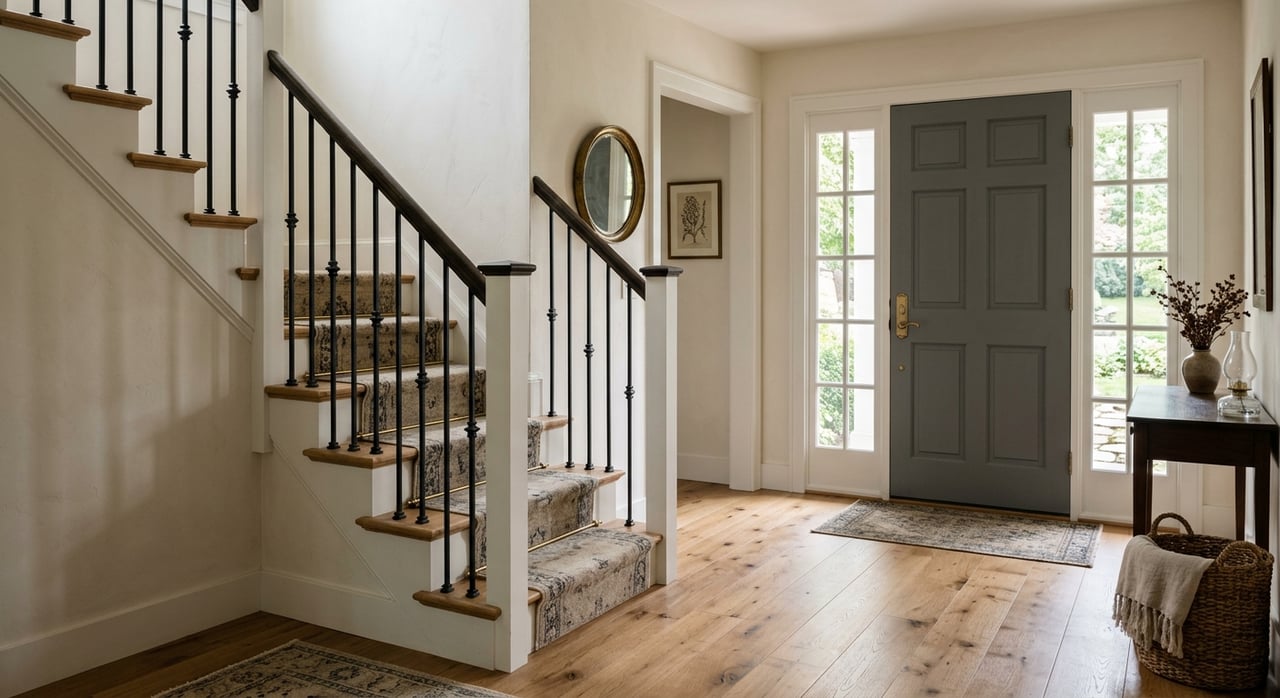
Hallways, staircases, and transitions
Hallways and staircases often get overlooked, but they play a major role in how cohesive a home feels. Because these areas connect rooms, neutral tones usually work best.
Light greige, warm off-white, or soft gray helps maintain flow and prevents visual interruption. In homes with beautiful staircases or original woodwork, neutral walls allow those details to stand out.
If your home has multiple floors, consider using the same color throughout hallways and stairwells to create a sense of continuity.
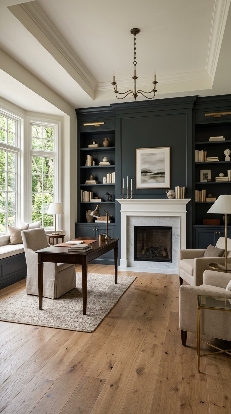
Home offices and productivity
With more people working from home, color choice in home offices matters more than ever. The right tone can improve focus and reduce stress.
Soft blues and greens promote calm and concentration, while warm neutrals provide balance. Avoid overly bright or saturated colors, which can be distracting during long workdays.
Natural light should guide your choice. If the office has limited sunlight, warmer tones help prevent the space from feeling cold or dull.
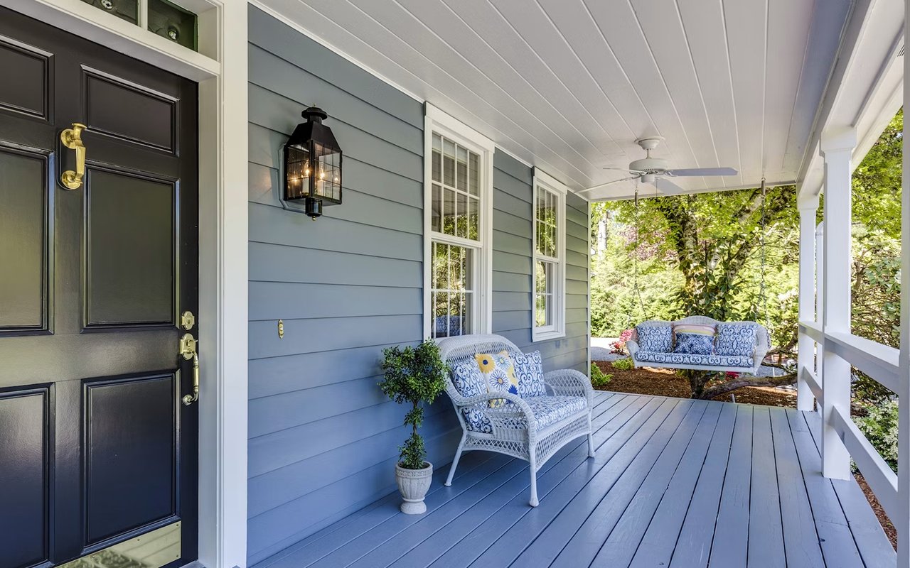
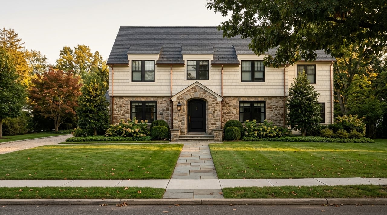
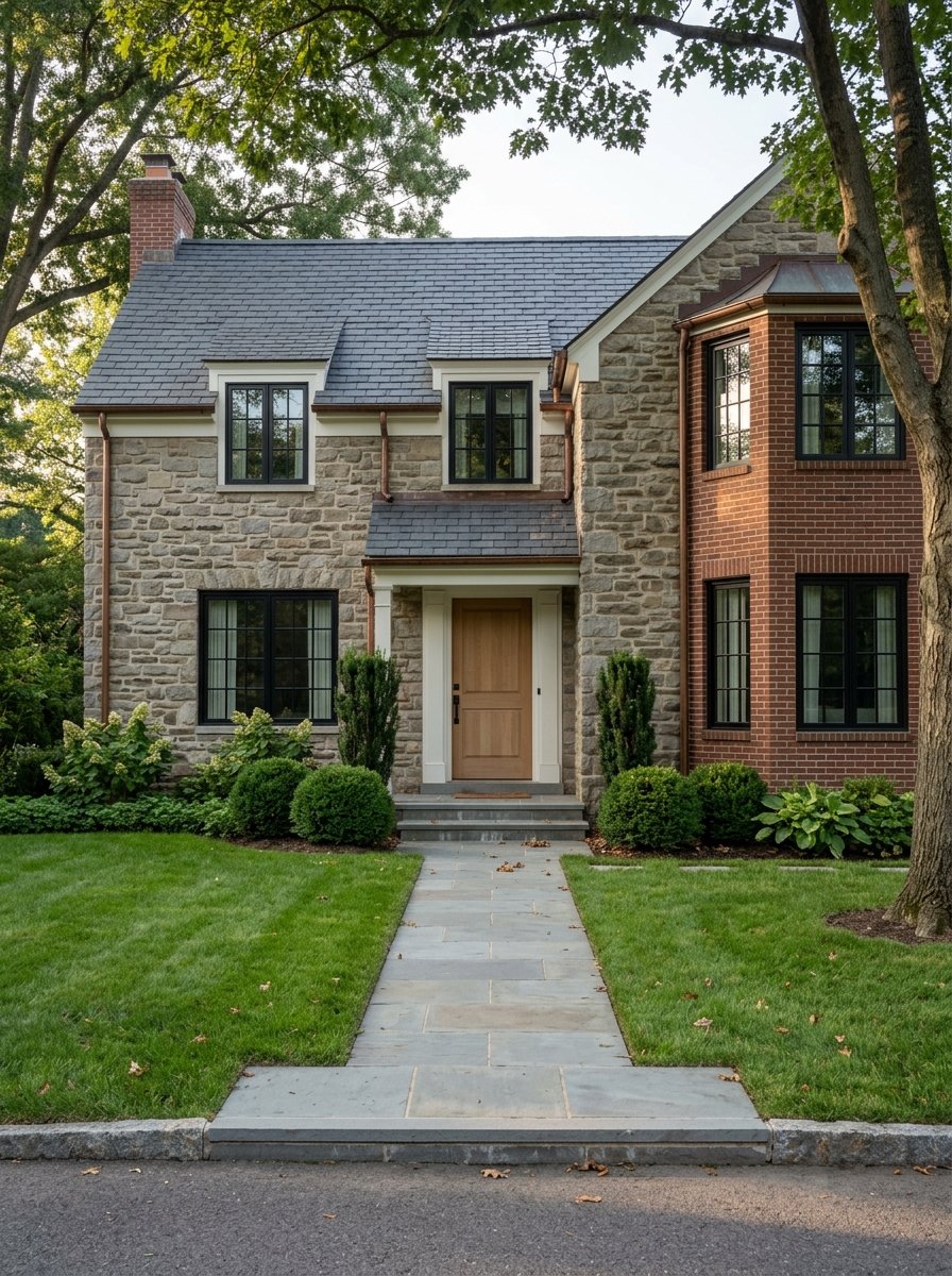
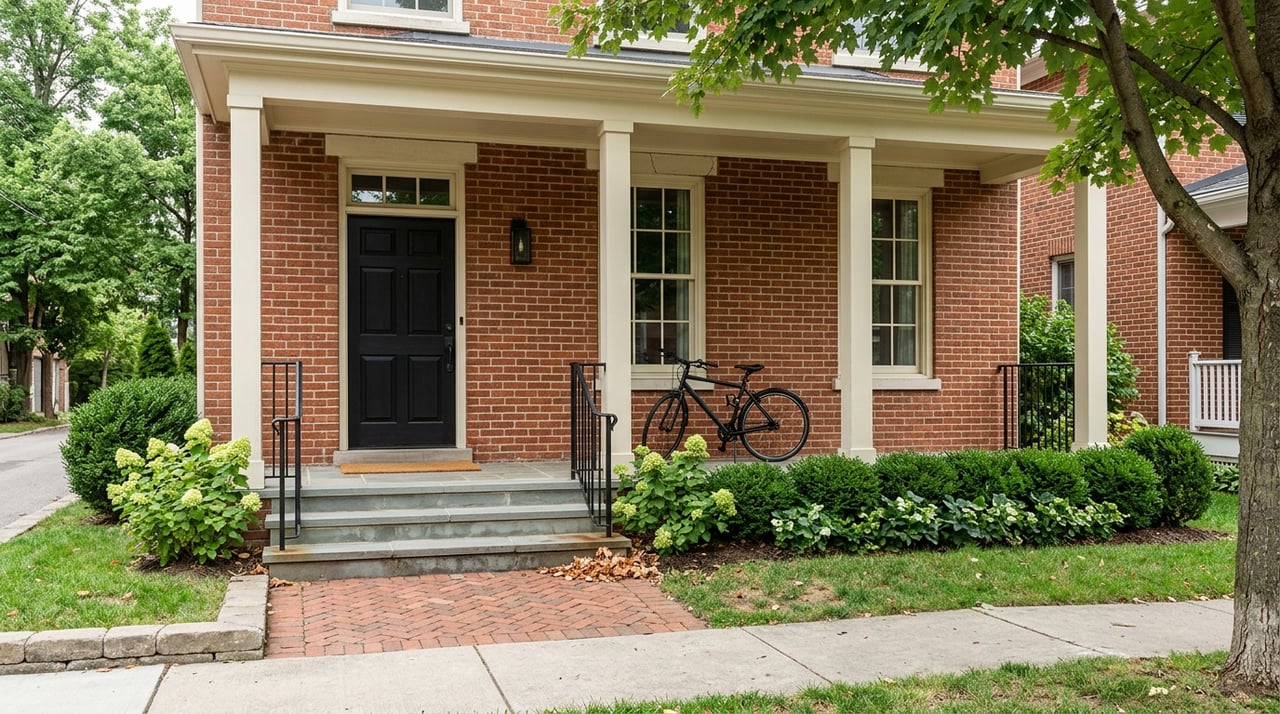
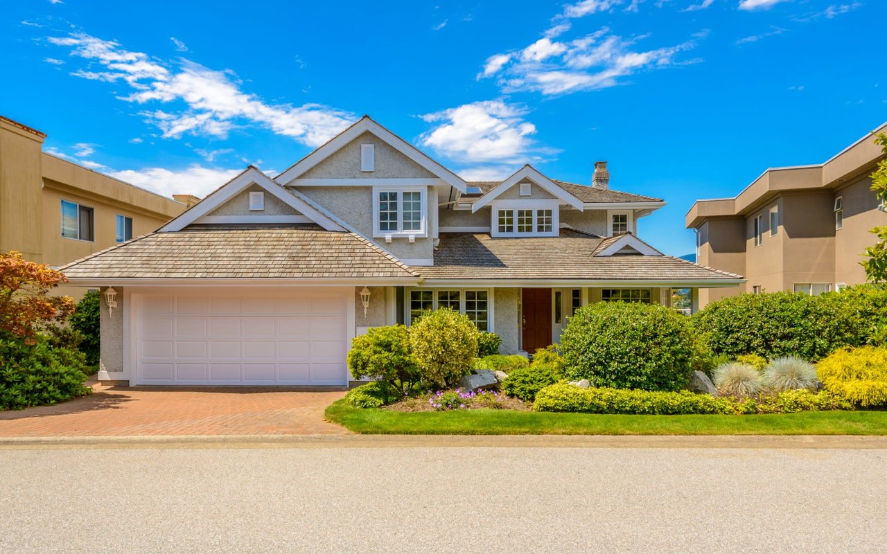
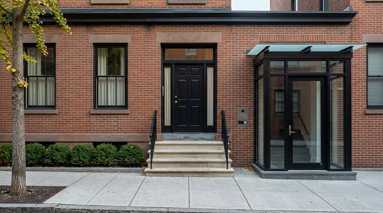
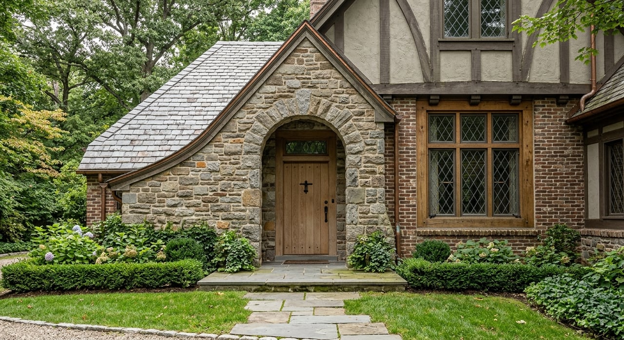
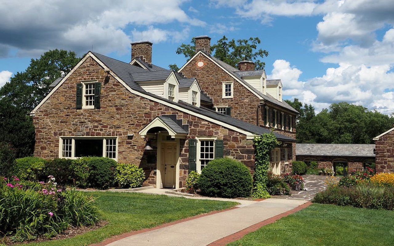
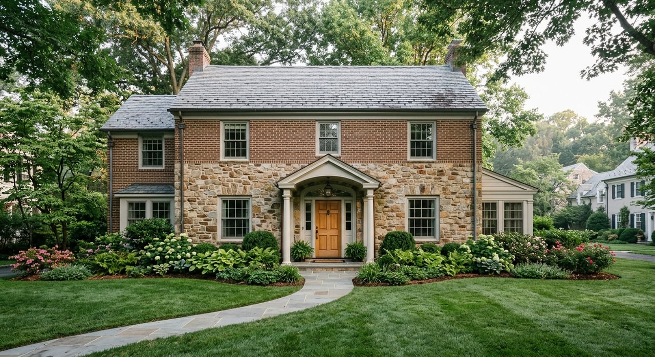
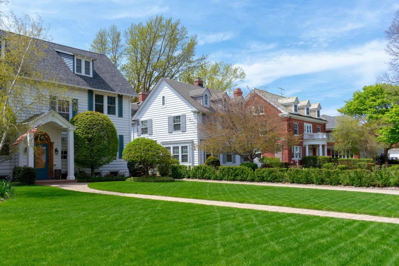
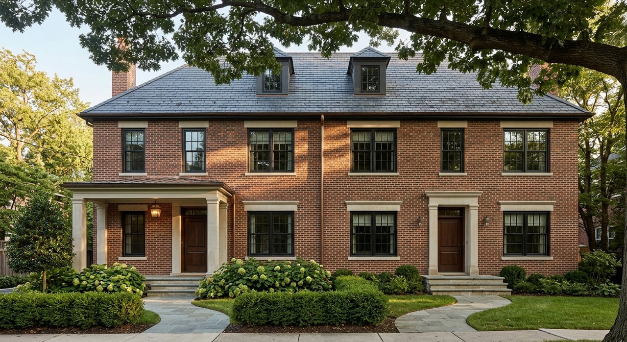
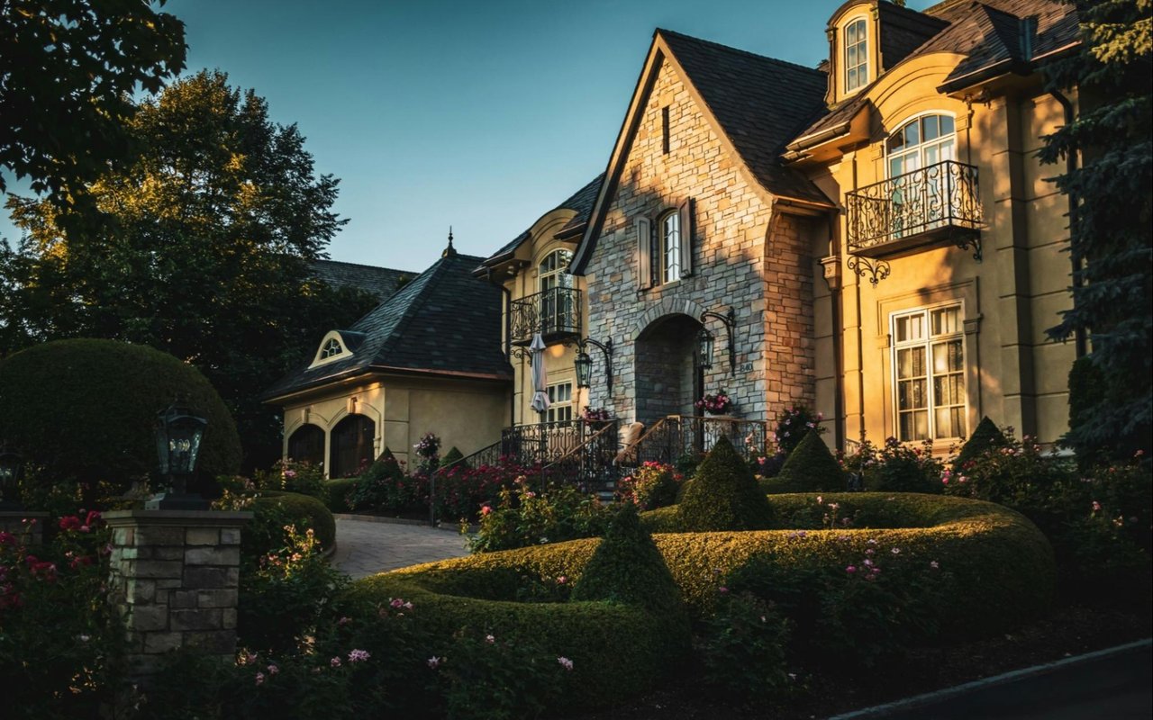
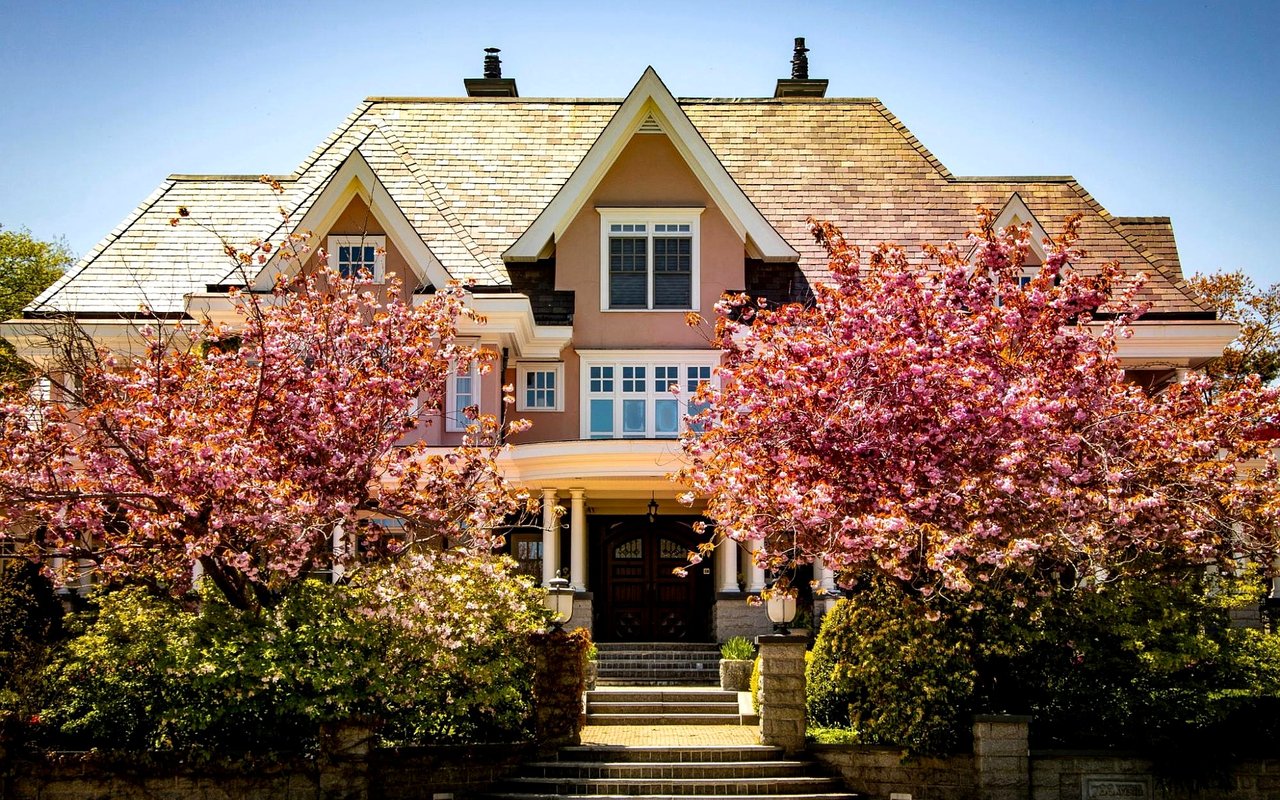
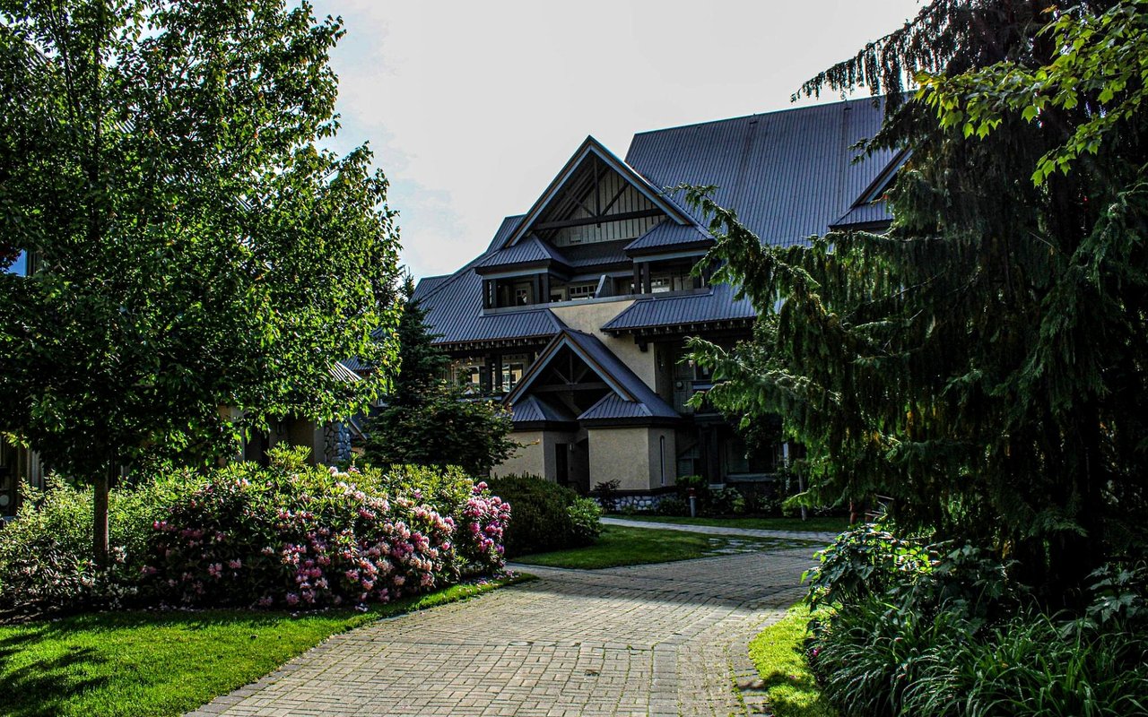
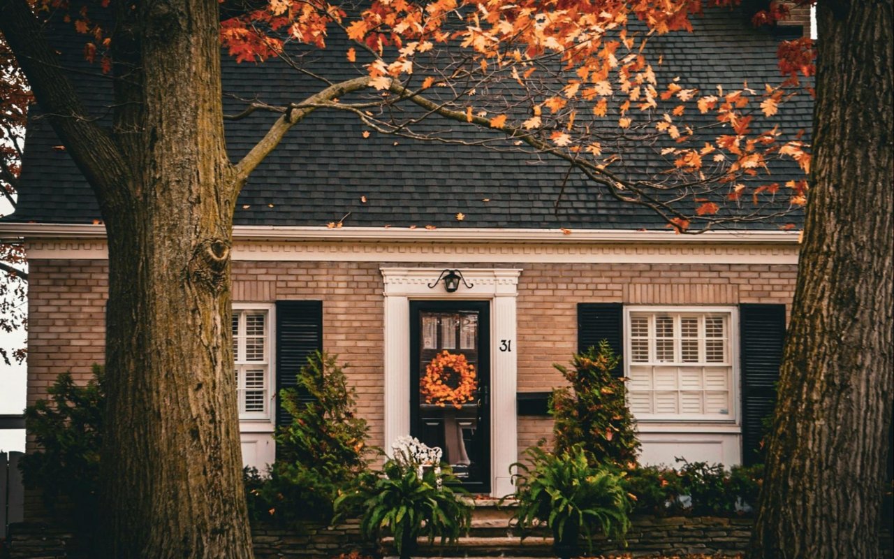
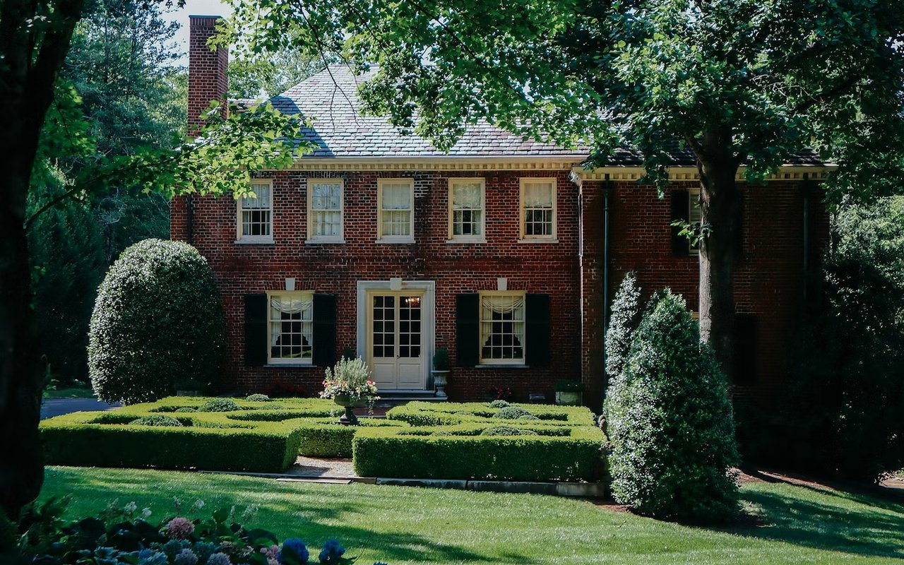
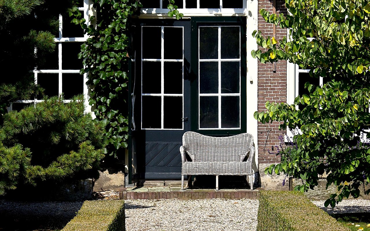
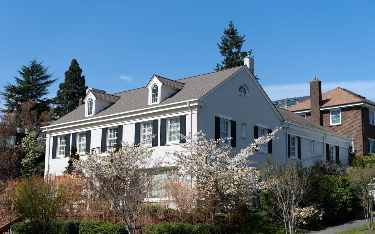
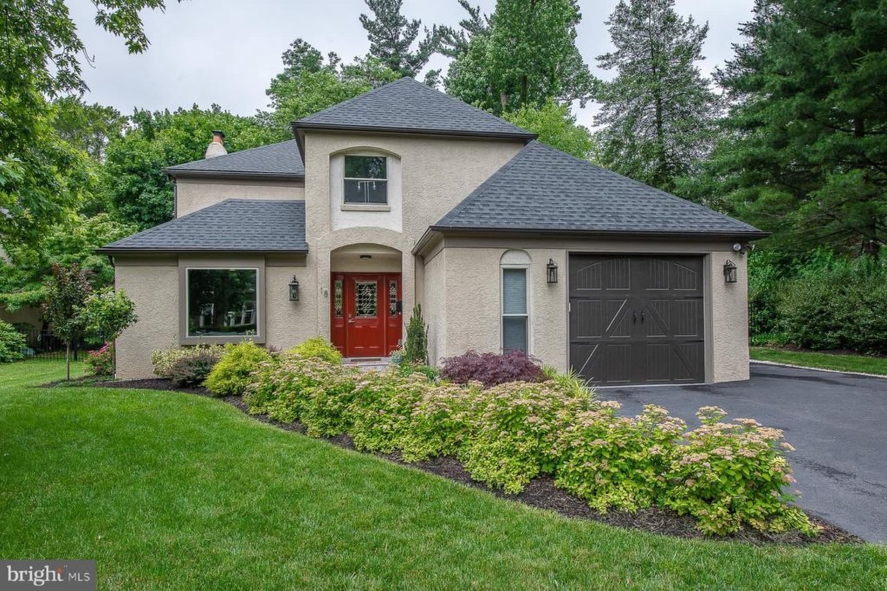
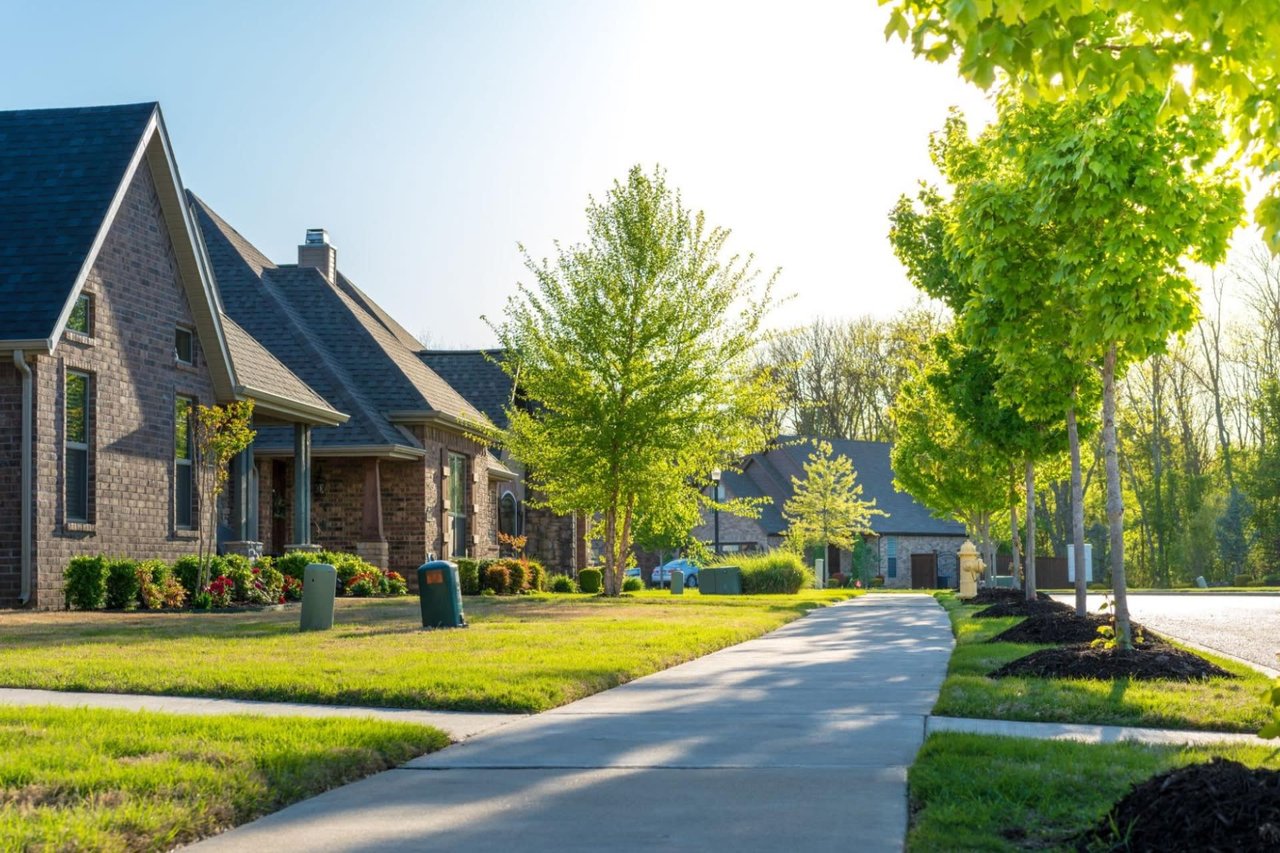
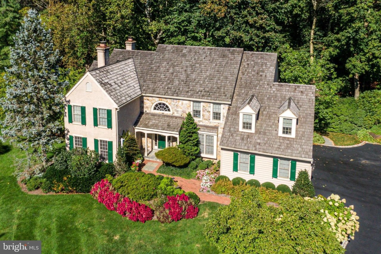
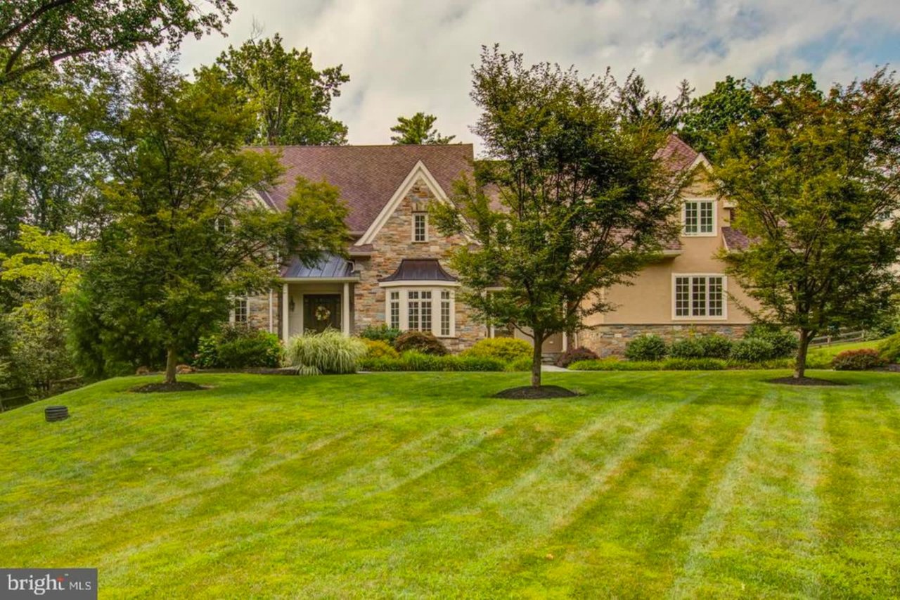
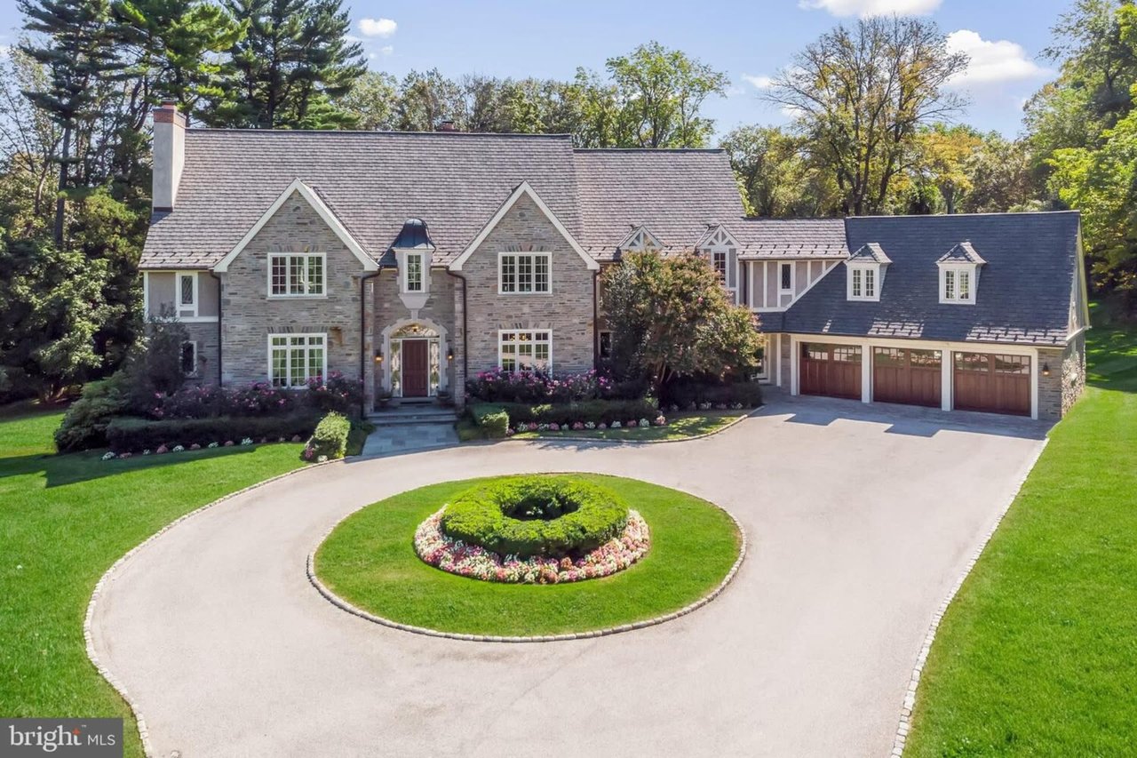
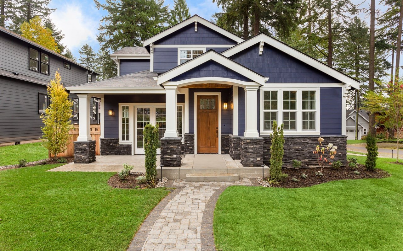
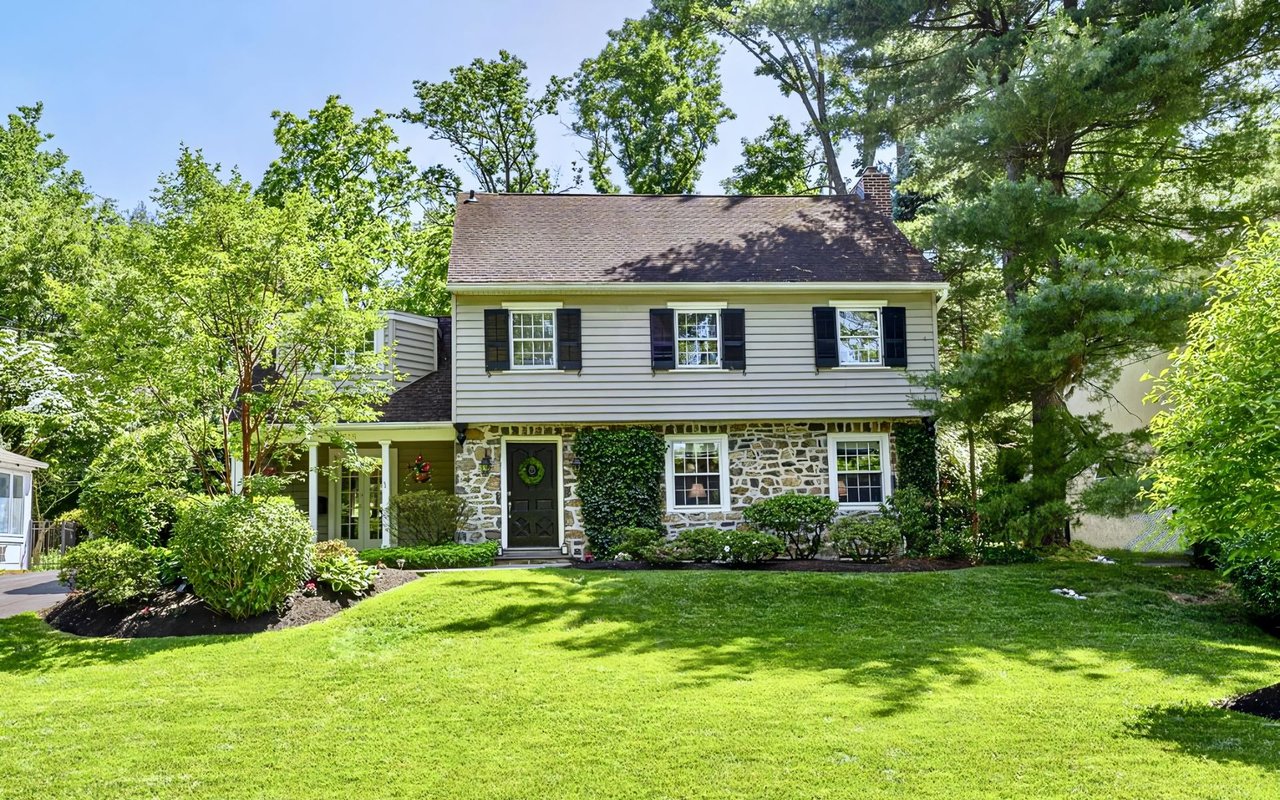
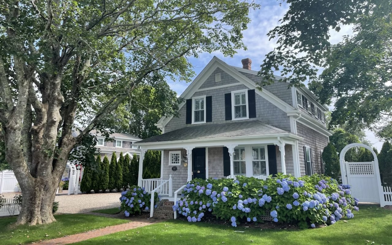
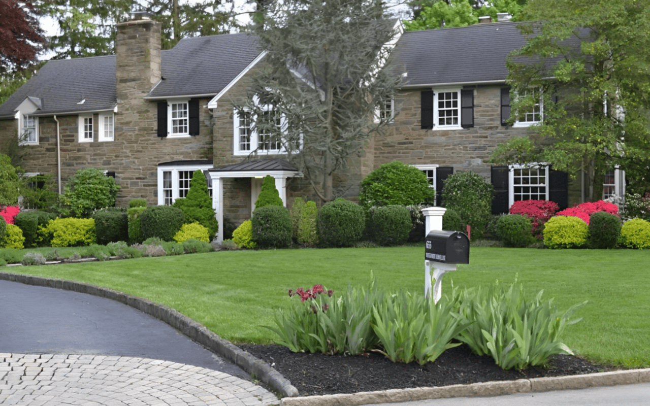
Exterior paint and curb appeal
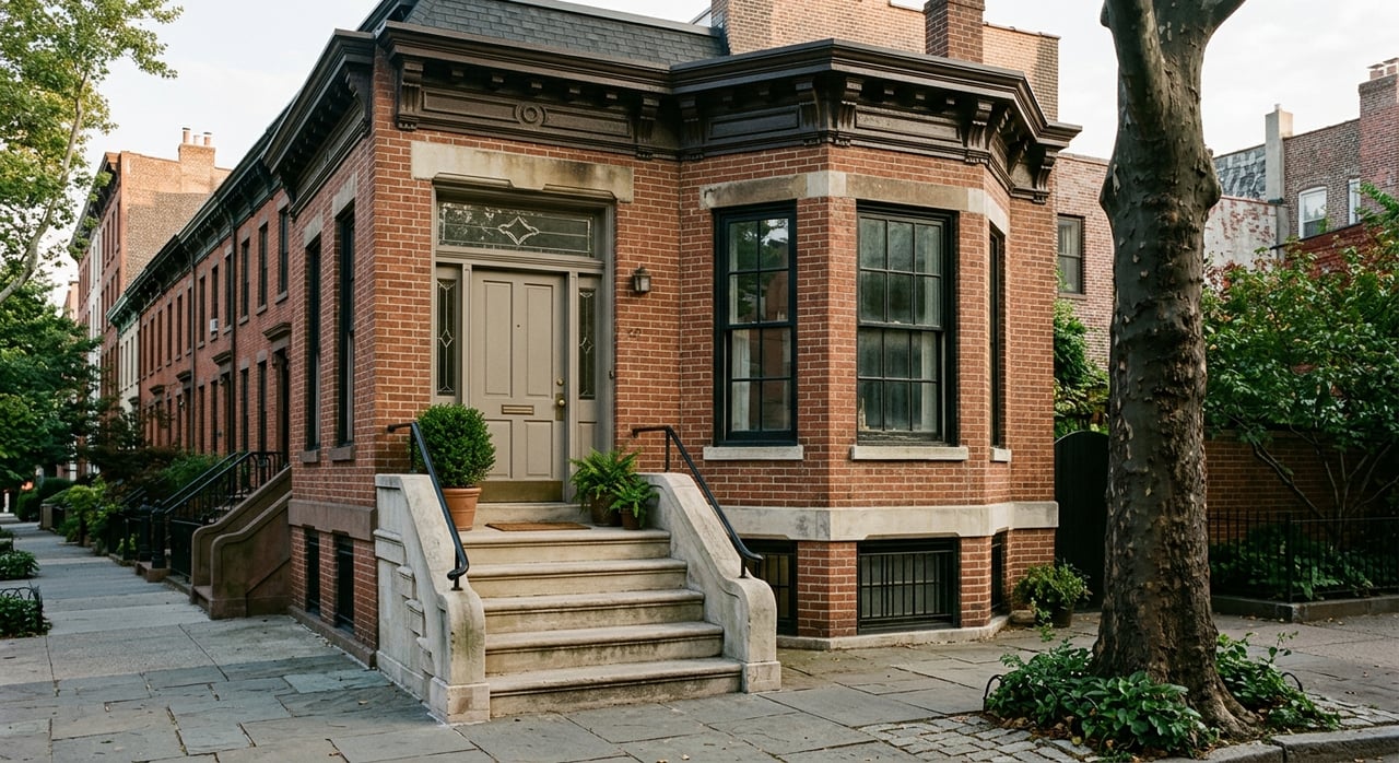
While interior color affects daily living, exterior paint directly influences curb appeal and market value. On the Main Line, classic color palettes tend to perform best.
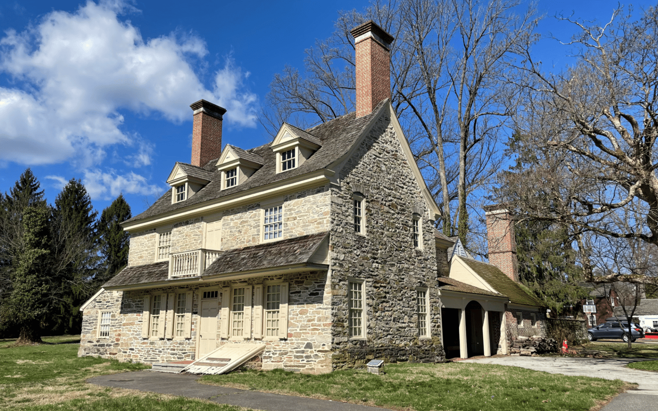
Stone homes often benefit from soft neutrals that complement natural materials rather than competing with them. Trim colors should be clean and crisp, highlighting windows, doors, and architectural details.
Exterior colors should also consider roof tone, landscaping, and neighboring homes to ensure visual harmony.
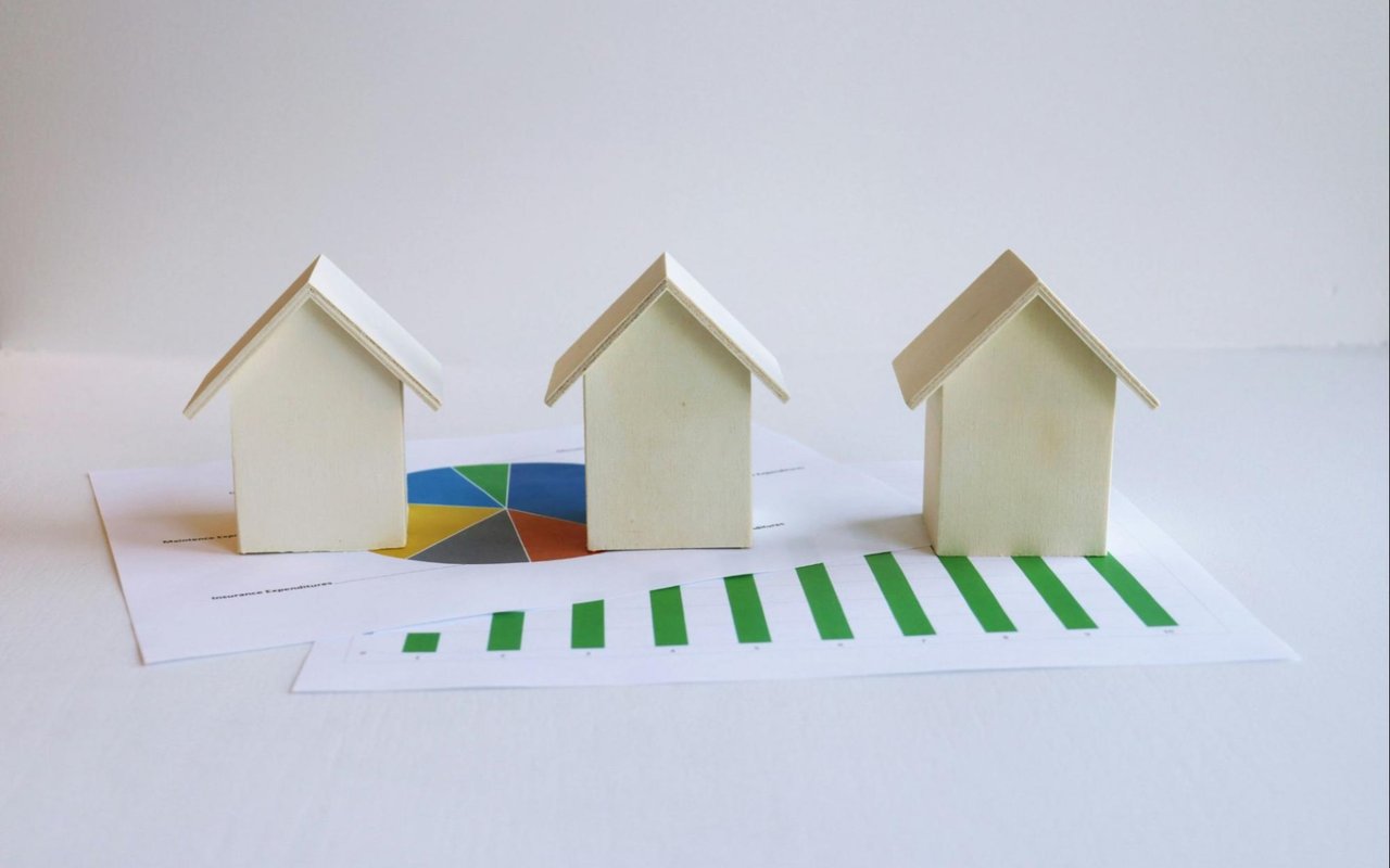
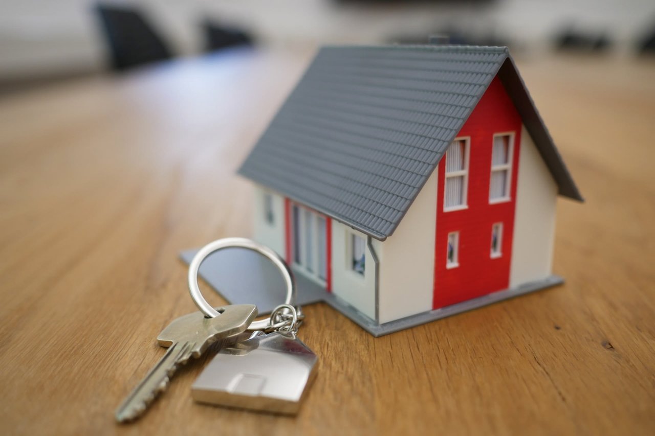
Why color choices matter when selling
Paint is one of the most cost-effective ways to improve a home’s appeal before listing. Neutral, well-chosen colors help buyers imagine themselves in the space and make rooms feel brighter, cleaner, and more updated.
In Main Line markets, buyers often look for homes that feel move-in ready. Fresh, cohesive paint signals care and maintenance, which builds confidence and can positively influence offers.
In Main Line markets, buyers often look for homes that feel move-in ready. Fresh, cohesive paint signals care and maintenance, which builds confidence and can positively influence offers.
Work with a Main Line expert
Choosing the right paint colors is about more than personal taste. It is about understanding light, architecture, lifestyle, and buyer psychology. When done well, color enhances daily living and supports long-term value.
Stephanie MacDonald of The MacDonald Team helps Main Line homeowners make smart decisions that align with both lifestyle goals and market trends. Whether you are preparing to sell or updating your home with an eye toward the future, Stephanie can offer guidance that helps every detail shine.
Connect with us today and take the next step toward a home that looks and feels its best.